Bad Website, Good Website
A Tale of Two Homepages
This is our first assignment in Art 43 for Fall 2019. The task was to discuss a good (well-designed) webpage and a bad (poorly-designed) one. Here we go.
The Bad Page
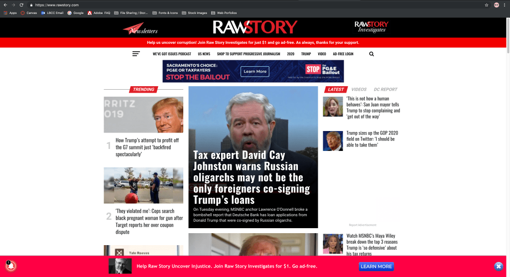
I’ve been reading RawStory since 2003, which is apparently also the last time they really looked at their site. Here’s why–in my opinion–this site suffers from bad design.
- Look at all that real estate to the left and right of the main body of the page. It’s totally undeveloped.
- Somehow this site manages to look both empty and cluttered. It’s like if you took all your stuff, piled it in the center of the room, and just left it there while you bleached the walls.
- I would check that “notification” in the lower left-hand corner of the screen but I suspect it’s a trap. Also that’s two (2) banners asking for money. Guys…you gotta play it cool.
- We’ve got thumbnails on the left, GIANT THUMBNAILS in the middle, and tiny thumbnails on the right.
- This confusing layout blurs the line between the site’s content and its ads, which seems somehow both underhanded and blatant. Blatantly underhanded!
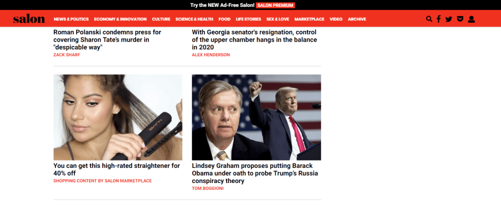
- Since this site is kind of where Salon.com drops their more sensational news, the blockiness, color scheme, and generally dopey layout comes in part from their parent site, where you can find even more egregious examples of sneaky advertorials:
The Good Website
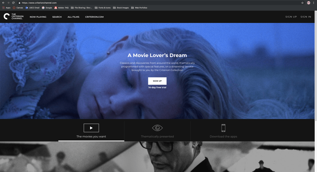
By contrast, here’s the Criterion Channel’s website.
- Since this is a streaming service it makes sense for them to spread the images out from edge to edge, suggestive of a movie screen. Looks nice, right?
- Instead of the insane clutter at RawStory, the Criterion Channel’s design is understated and the designers have chosen movie stills with (in the first case) somewhat muted colors and (in the second case) a black and white image. This is a lot easier on the eyes than the stark red, white, and black scheme.
- The icons are tastefully designed, even if the one for “Thematically presented” doesn’t quite make sense. (Coming up with an icon to match the idea of thematic presentation seems to me to be a tall order, so no points deducted.)
- They’ve got the black banner along the top and then another one in the middle and… that’s it. None of this banners upon banners upon banners craziness for the Criterion Channel.
- In keeping with the generally understated design this site has a relatively small number of links to click at the top of the screen.
- The sans-serif fonts likewise keep this site elegant yet modern. Overall this feels like a well thought out niche entertainment service. (Which it is, incidentally.)
