What Am I Doing Here?

Mission Statement

I think the main things I’d like to accomplish this semester are:

  • Learn more about the programs in the Adobe Creative Suite I haven’t worked with very frequently, like Dreamweaver and XD, and improve my skills in, uh, all the other ones.
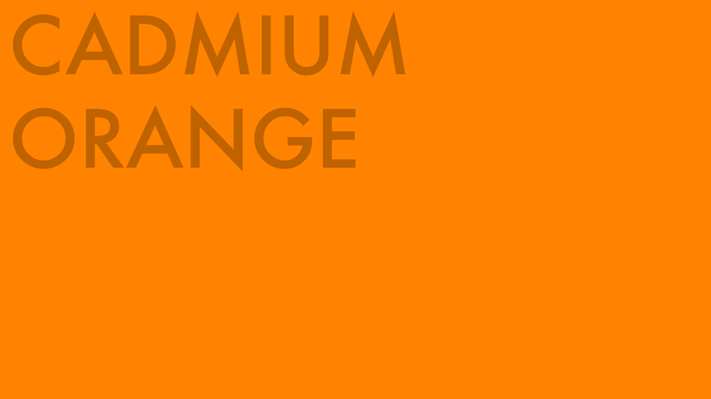
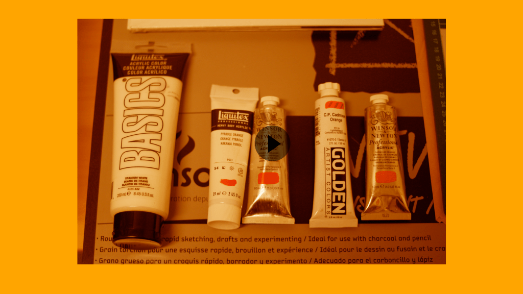
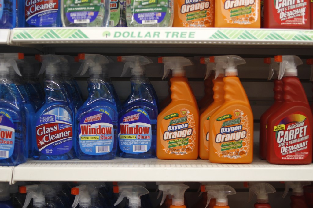
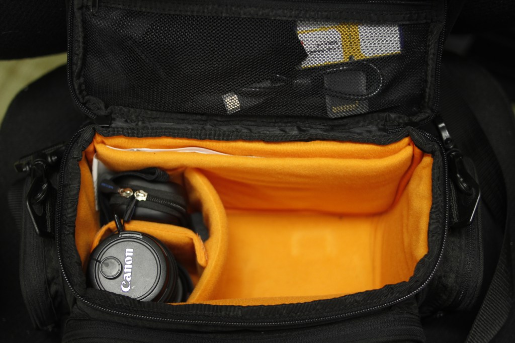
  • Improve my taste (for lack of a better word) when it comes to working with color. I’ve been stuck in the Blue and Orange Zone for a while and even though it’s comfortable and it works there’s like… a million other colors out there.
  • Work more with integrating text and images in my design work. In my day job I make a lot of slides and I’m constantly trying to come up with novel ways to avoid the IMAGE>BLOCK OF TEXT trap. (I mostly succeed! But I’d like to get better at it.)
  • Lastly, I’d like to get a little bit into UX design concepts. I know what bad UX is; what I’m less certain about is how to make it good.

Website Concept, Part II

Design Idea

I did a fair amount of looking around and googling “avant garde web design” which believe it or not is an actual thing people do and ultimately I decided that probably the best thing I could do would be to… keep things simple and bold and really put the focus on the typography and the way the various shades of orange play against each other. It will probably require at least a little bit of revision as the process goes along, but I’m feeling pretty good at the moment about it.

Gallery is below: check it out!

Side Note! “Cheap Orange” came about because I was curious to see how well really inexpensive paint stacked up against the pricier stuff. They’re not included in the picture I’m using to represent the video but I bought two tubes of Amsterdam Acrylic along with the four (pricey!) tubes you can see above. So now the last two tests will be done with Amsterdam Acrylic Vermillion and something called Reflex Orange; the latter is a bright, almost neon orange that looks a little bit like the orange rubber they use to make traffic cones.

I’ve tentatively scheduled the shoot for the demonstration over a couple of days in the next week or so. I’m hyped about this project!

Web Page Concept

Basic Idea

The basic idea for the web page is as follows:

  • Since I chose the color orange, the idea of doing something with orange paint seemed like a natural fit. While I was googling around (I had forgotten the term “mass tone” and was trying to find something that would remind me) I ran across this document.
  • So the idea then became a series of benchmark tests on several different types of paint: Two cadmium oranges, two pyrolle oranges, and a pair of “other” oranges, just to round out the tests.
  • The two cadmium orange brands will be Golden Acrylics and and Winsor & Newton acrylic paint. The two pyrolle oranges will be Winsor & Newton and Liquitex Heavy Body acrylic. The last two (which will be tested but not compared, since they’re not the same color) will be Golden Acrylics Vat Orange and Liquitex Cadmium Orange Hue, which is not a true cad orange.
  • The tests will reveal the following qualities of each paint: mass tone, undertone, and tinting strength.

Here are some photographs to give you an idea of the process and result of this; the final product will be on video.

Orange

Some Things to Know About Orange

  • Orange is between yellow and red on the color wheel and is a secondary color, created by mixing red and yellow pigments. Orange’s complement is blue.
  • The Sanskrit word naranga gave Europeans a loanword they could use to describe the fruit trees that started showing up in the late 15th and early 16th century. The English word orange is derived from this root by way of Arabic, Italian, and French.
  • Orange is associated with Protestantism, and the orange band on the Irish flag represents the Protestant minority in Ireland.
  • Orange is also identified with Hinduism and Buddhism. In Hindu iconography, Krishna is often depicted wearing orange; in Buddhism the color represents illumination. Wandering holy men in India wear saffron colored robes; Buddhist monks in a variety of schools wear orange or saffron robes.
  • Due to its high visibility even in dim light, orange is a popular color for life rafts and flotation vests, safety markers, high-visibility clothing,
  • The “black box” on an aircraft (there are actually two such devices on every aircraft) is actually orange to increase its visibility in a debris field.
  • Orange is the national color of the Netherlands due to the royal family’s house, the House of Orange-Nassau.
  • The coat of arms of the United States 1st Cavalry Regiment features a gold dragon on an orange shield.
  • Numerous brands include orange in their logos and color sets, most famously FedEx and The Home Depot.
  • Due to its high visibility, orange is a popular color in sports logo/jersey designs. The Anaheim Ducks and Philadelphia Flyers in the NHL sport orange jerseys; the New York Knicks (lol) and the Oklahoma City Thunder in the NBA have an orange/blue color scheme; and in MLB the Baltimore Orioles and San Francisco Giants have a black and orange scheme.

Haiku Assignment Part the Third

Here below are the results of the assignment to make three separate but linked webpages using HTML. The content of each page is a line of the haiku we selected. (Mine, in case you’ve forgotten, is In A Station of the Metro by Ezra Pound.)

Not terrible? Not as good as I’d hoped. But the first poem you write in a new language probably won’t amount to much.

Here below is the code.

I kept it simple, as befits my skill level, and did my best not to borrow any code from anywhere. It came out okay, I guess: the links all work, which of course is the real point of the HT in HTML, and I feel pretty good about the way the layout looks the more I look at all three pages together.

Lessons Learned

  • HTML is tricky! It’s good for putting text onto a page but it’s woefully inadequate at making things look a certain way. The same goes for CSS, which inexplicably requires one to write all kinds of arcane code to get something approximately vertically centered.
  • For those of us out there who never bought into the idea that all the REAL CREATIVE TYPES use Apple computers, there’s a neat new code writer app for Windows 10 called–appropriately enough–Code Writer. It’s somewhat less rudimentary than using WordPad or whatever they call the raw text editor in the Apple OS but it won’t correct your mistakes for you or alert you when you’ve written wonky code.

Color Observation Assignment

Last Tuesday we were tasked with taking three sets of six pictures: one set of purple things in our neighborhood, one set of white things in our house, and one set of red things in someone else’s kitchen. Here are the results from my expedition.

Purple Things in the Neighborhood

The thing that mostly surprised me about this was how many purple and purple-adjacent plants there are.

White Things at Home

What I learned: there are not that many interesting white things in my apartment.

Red Things in Someone Else’s Kitchen

I used my office kitchen for this part of the assignment since (trust me) nobody wants to see pictures of my friends’ kitchens. I think it was fate, though: that M&M wasn’t sitting on the napkin but it was just hanging out on the counter when I got there.

Haiku Assignment Part II

So, as you’ll recall from last time this was my initial sketch for the layout of the Ezra Pound haiku In a Station of the Metro:

And here’s the final result:

Not 100% what I had in mind, but close!

It’s pretty close to the original concept, minus the tile effect where every letter is contained within its own square. Ultimately it seemed like too much trouble to go to in order to get it figured out. Also I think it might have cluttered the design unnecessarily, which I really wanted to keep simple. The colors are close to the ones in the reference image of the subway station (below) and I like the way the title of the poem and the author’s name hang together.

Most of the work on this page was done by the CSS I put in, which helped lay out the position of each text element. Some of the CSS was, uh, appropriated from Stack Overflow; I subsequently adjusted the little snippet of code I borrowed and applied the changes to the different elements. By the time it came to writing the HTML portion, mostly all I had to do was add the text.

Haiku Assignment — Part 1

Ezra Pound’s “In A Station of the Metro”

I selected Ezra Pound’s In a Station of the Metro as my haiku for this assignment. The poem reads as follows:

The apparition of these faces in the crowd:

Petals on a wet, black bough.

The poem was inspired by the Concorde station of the Paris Metro; Pound composed it in 1912 and it appeared in Poetry magazine in 1913. It is considered one of the first haiku in English despite not adhering to the traditional 5-7-5 syllabic scheme; however, the economy of language and reliance on images to express a feeling set it within the tradition.

My concept for the visual representation of this poem is based on the physical appearance of the La Concorde station itself:

The letters on the tiles look really cool, so I thought it would be fun to try to get the poem arranged in a similar way on the web page, like so:

Like this, but not as klutzy.

I plan to use a muted palette for this design; probably black, white, and navy blue to emulate the appearance of the subway station itself.