Design Idea
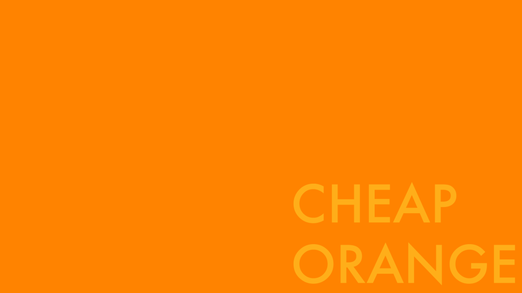
I did a fair amount of looking around and googling “avant garde web design” which believe it or not is an actual thing people do and ultimately I decided that probably the best thing I could do would be to… keep things simple and bold and really put the focus on the typography and the way the various shades of orange play against each other. It will probably require at least a little bit of revision as the process goes along, but I’m feeling pretty good at the moment about it.
Gallery is below: check it out!

This is the landing page: a blank orange field. 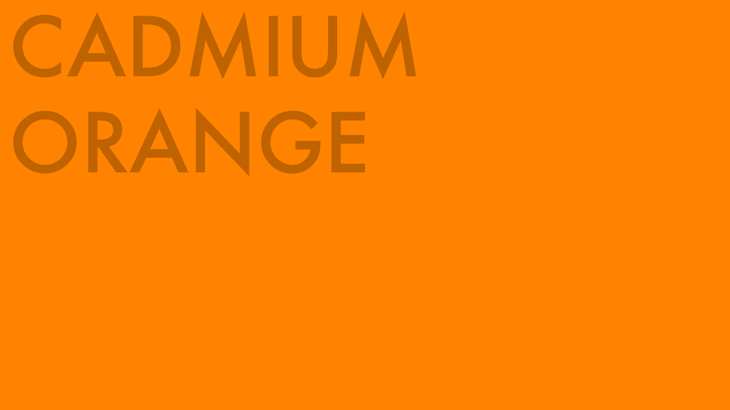
Hovering in different areas of the screen will pull up the links to the three comparison videos 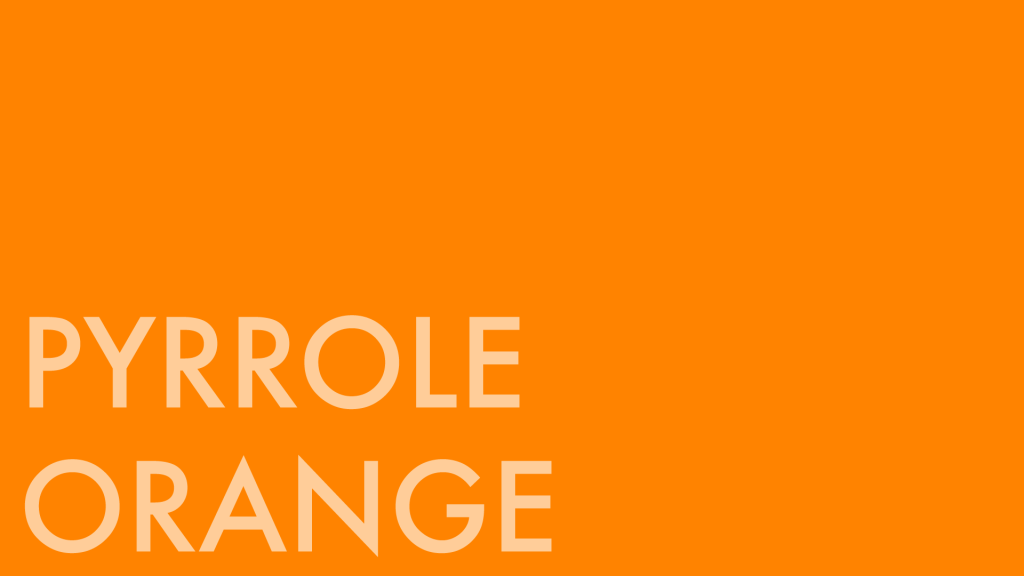

Still haven’t quite decided how each video page should look but ¯\_(ツ)_/¯
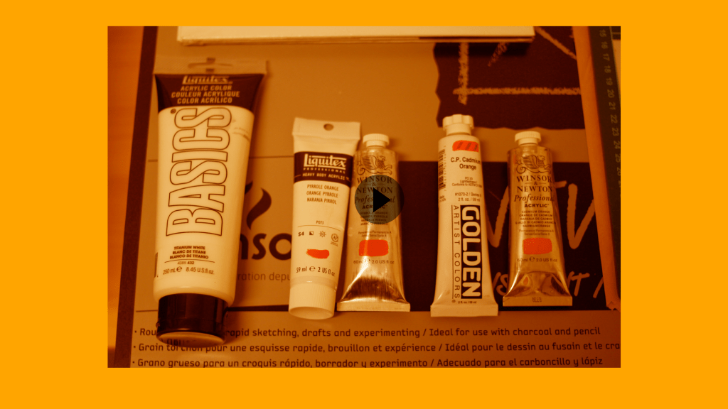
Side Note! “Cheap Orange” came about because I was curious to see how well really inexpensive paint stacked up against the pricier stuff. They’re not included in the picture I’m using to represent the video but I bought two tubes of Amsterdam Acrylic along with the four (pricey!) tubes you can see above. So now the last two tests will be done with Amsterdam Acrylic Vermillion and something called Reflex Orange; the latter is a bright, almost neon orange that looks a little bit like the orange rubber they use to make traffic cones.
I’ve tentatively scheduled the shoot for the demonstration over a couple of days in the next week or so. I’m hyped about this project!

FOund it!!! Great!!!!!! now how are you going with it? you need to reveal the words – on roll over right???
LikeLike